
Responsive web design
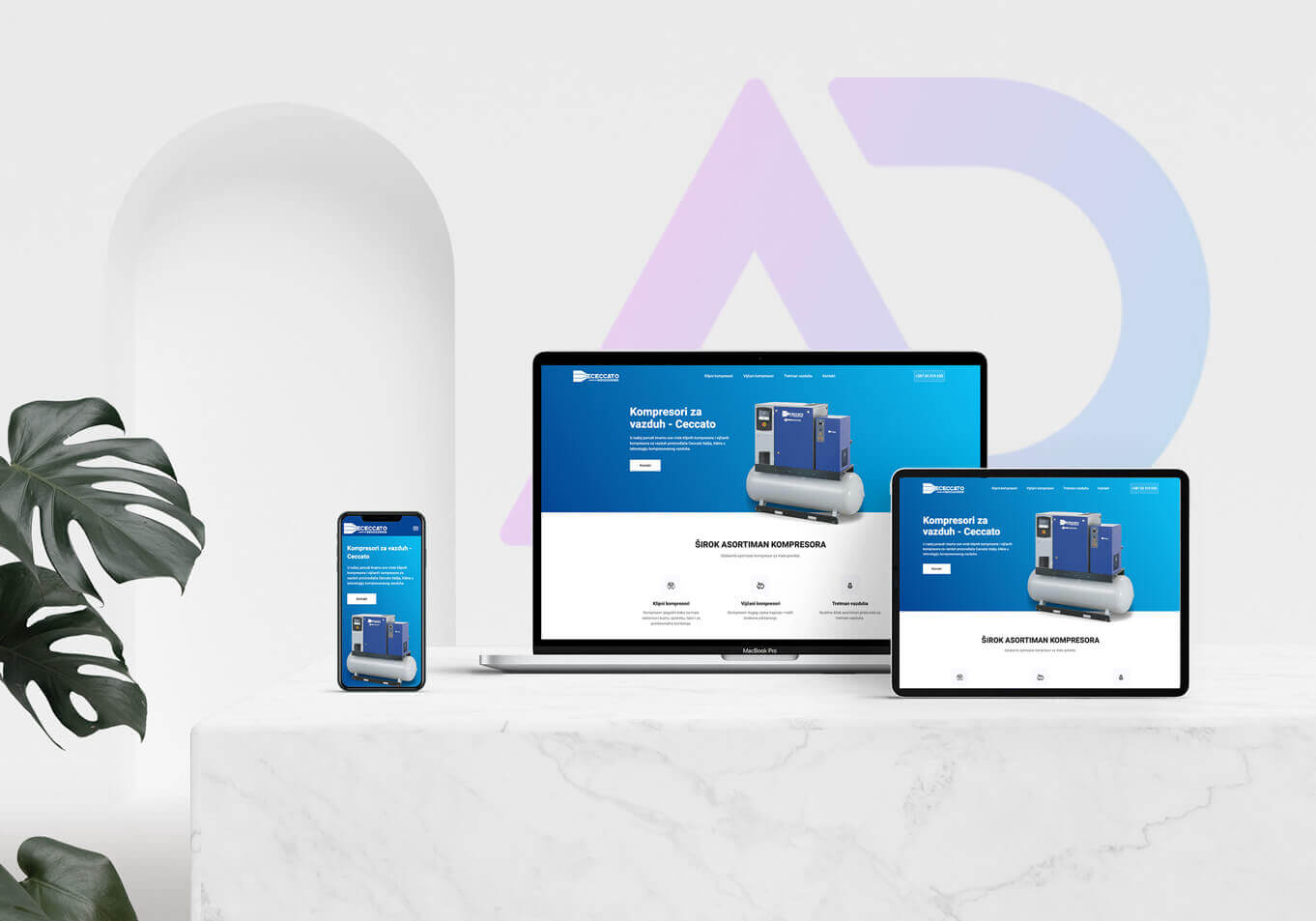
Do you have a website that is not mobile-friendly? Do you remember seeing a stretched desktop version on your phone, where you had to zoom in to read or see anything? That is not a pleasant experience!
For this reason, in 2015 Google introduced a change to its search engine algorithms, which now consider a website's mobile optimization as a ranking factor. This fact is enough to demonstrate the importance of responsive (adaptive) website design.
Put simply, a website on a smartphone must be user-friendly. If it is not, your brand loses potential sales. In fact, 40% of users went to a competitor's website after a poor mobile experience.
What is a responsive website?
A responsive website adapts its appearance and element layout to the device on which it's viewed (smartphone, tablet, computer, etc.) to offer a quality experience to the end user.
A responsive website arranges its elements so that:
1. text can be read without zooming,
2. buttons and scrolling controls are easy to use,
3. horizontal scrolling is avoided,
4. images are displayed appropriately.
Did you know that the number of smartphone users exceeded 2 billion in 2016?
Websites that aren't optimized for small screens may fall in search engine rankings, making them difficult or impossible to find online.
It is true that more than 60% of internet searches now come from a mobile device.
What is responsive web design?
Responsive web design is a system in which a single website has a fluid, flexible layout that adapts to the screen size of the user's device, with one URL and one source of content.
The importance of responsive web design lies in offering an optimized website browsing experience.
Essentially, your website will look great and work well on a computer (or laptop), tablet and mobile phone browser.
In the past, developers built more than one website to accommodate different screen sizes. With the number of device types on the market today, that seems completely inefficient, does it not? This helps explain why responsive web design is no longer a trend, but a step forward in website development and a requirement for your business to succeed.
Benefits of responsive design
The most important benefit of responsive websites is that every user on any device will have the best possible experience on your website. It's also an excellent way to filter content and ensure users see only the most important information.
Why responsive design matters for your business:
1. you increase your reach among customers and clients on smaller devices (tablets and smartphones),
2. a quality experience can increase lead generation, sales and conversions,
3. analytics, tracking and reporting can all be in one place,
4. reduced website development time and costs,
5. staying ahead of the competition (as many as 42% of Fortune 500 companies currently do not have responsive websites!)
Over 5,7 billion searches are made on Google every day.
The future of responsive design for mobile devices
We know that Google requires the following element optimizations for a quality mobile-friendly user experience:
1. text at a readable size, without needing to zoom,
2. content that fits the device's screen, without horizontal scrolling
3. placing links and buttons appropriately so tapping is easy,
4. a reasonable website loading time,
5. no Flash! (Hopefully most of you are now wondering: “What's Flash?”)
The rise of mobile devices is only the beginning of the shift toward more convenient web use. You need to ensure users can browse your website anywhere, on any device, as devices such as smartwatches become more popular.